[ MENU ]
[ MENU ]
Product Cards Optimization
2021
E-commerce
Website

Overview
A product card is a visual container that holds a single or related group of product information. Initially, MWG Retailer Group, with two leading websites, Thegioididong.com and Dienmayxanh.com, had no unified pattern or logic in the product cards used across the system.
By 2020, the websites faced challenges with information architecture - the product cards displayed inconsistencies between domains and accumulated over the years, leading to design and tech debt. It badly affected our team's execution speed and morale. More importantly, it likely caused user confusion and potentially impacted revenue.
This project aims to establish a systemic design approach, including clear UX guidelines for the product team and developers. This will ensure product cards create a consistent and meaningful user experience.
Process
The competitive landscape for discount-focused apps is heating up, with Kucha leading the pack with 10 million downloads. The growing popularity of these apps reflects the increasing consumer demand for finding the best deals and saving money
Audit current situation
Define what is a good product card
Ideate & Iterate
Design & Develop
🔍 Audit current situation
Lack of consistency
Some components were not available on some platforms
Component features were not aligned across platforms
➔ No source of truth: There was no clarity on where to look
when making decisions
The UI distract from scanning information
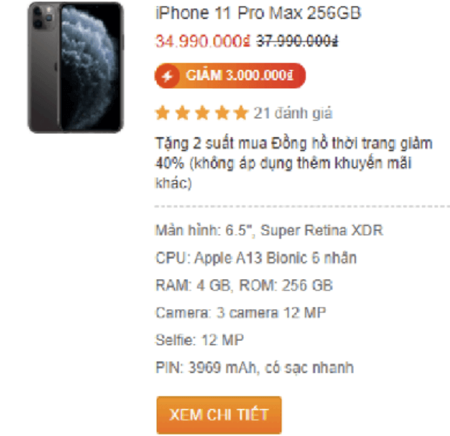
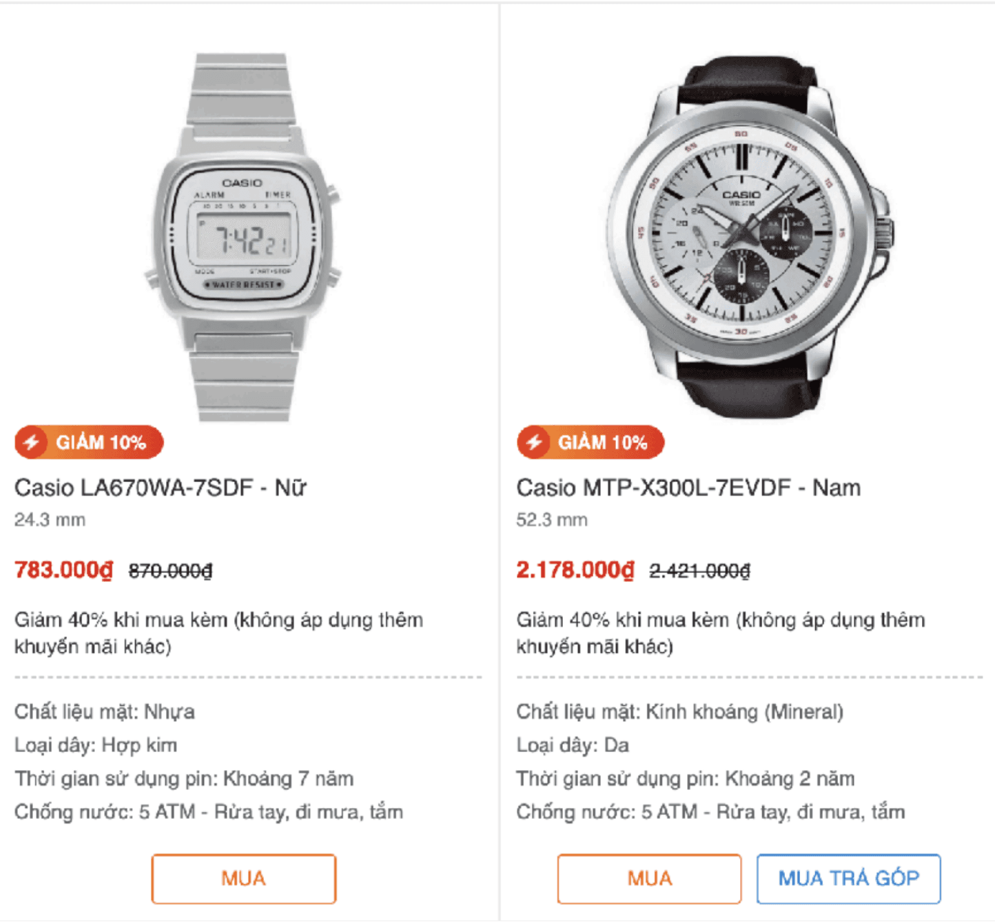
The labels feature a wide array of colors—red, blue, orange, and yellow.
However, the prominent use of a strong red can make it challenging for users to quickly identify essential information such as room size, product images, and prices. Additionally, it is important to clarify the meaning of the term "Giảm sốc" (shocked discount). If every product is labeled as "Giảm sốc," yet none are genuinely discounted, it diminishes the effectiveness of the promotion.
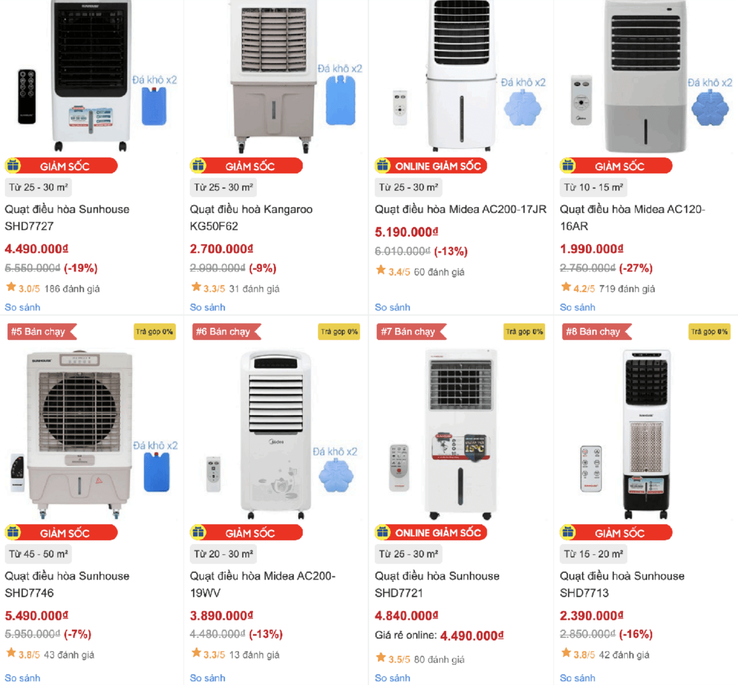
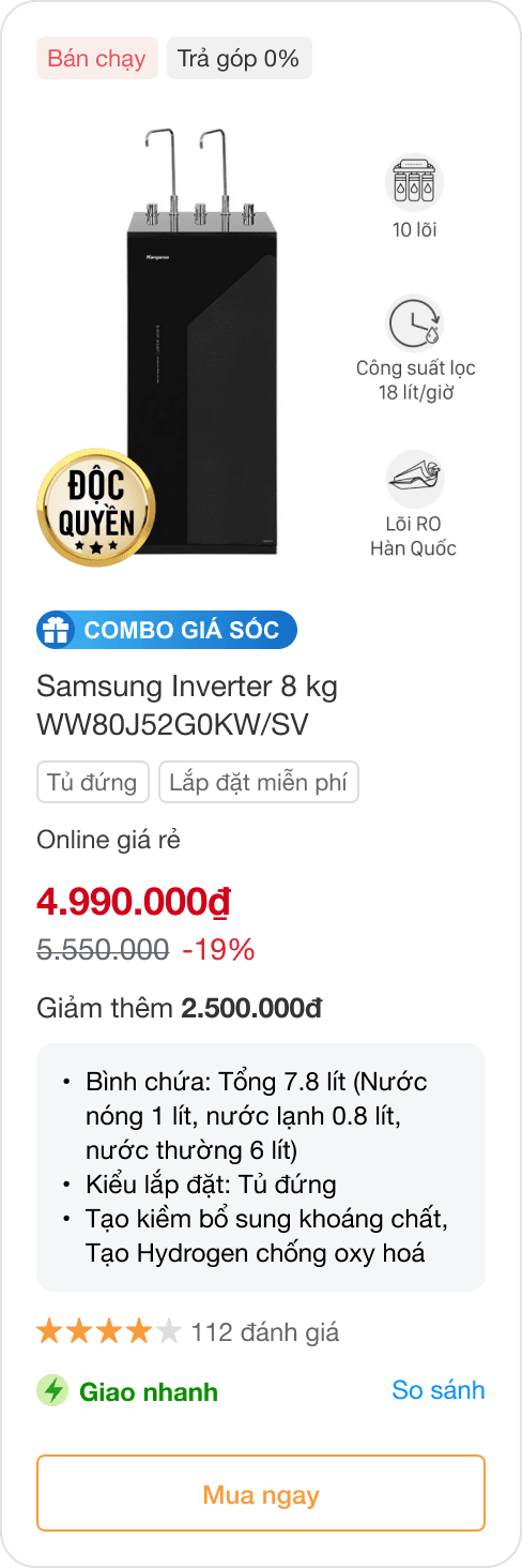
Too much information
Re-think about the "zoom in" concept. MWG successfully applied this concept for a product line that required the user to compare many specifics, especially if the products looked similar. Months by month, it's getting abused.
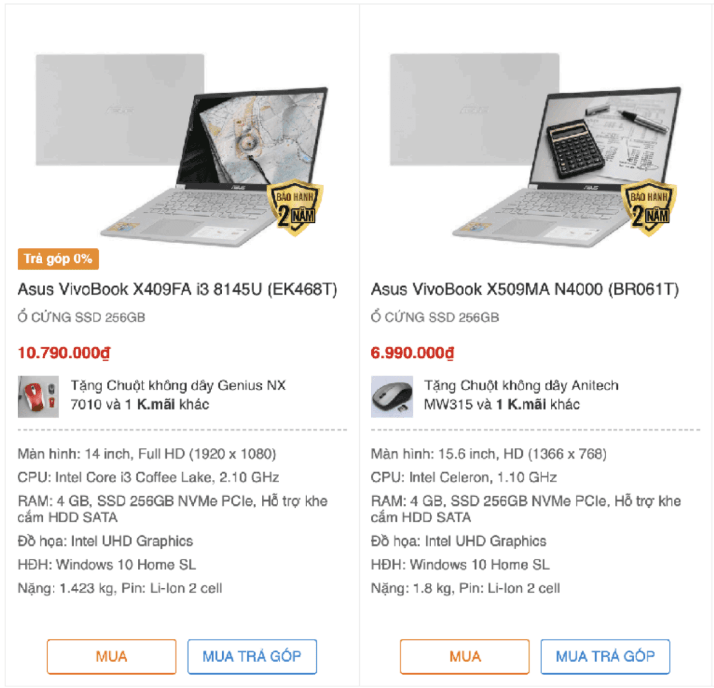
Good “Zoom in”
When buying laptop, users need to compare many parameter among lots of laptops looked similar. For instance, the product belong to a line but difference about technical specifications. Without this side by side comparison led user feel inconvenient.
Does it need “zoom in” concept?
Discovery
Normally, usage data plays a big role in identifying problems. For this case study, I relied on other discovery methods, including desk research, consumer feedbacks, competitor research. Here are few key highlights:
Product Details = Good
The difference between these two screenshots is obvious: the TV photos are no help in deciding between the products. A guy in a canoe vs. a football player? What, because I watch more football than watersports, I'll buy the TV showing a football player?
This is a good example of why copying the biggest sites' designs is not always good. Because Amazon hawks a monstrously wide product range, they use a standardized gallery layout that sort of works for many different category pages, without being optimized for any individual category.
In contrast, Pottery Barn is optimized for its narrower range of products, so its category pages have more detailed photos.
Source: NNGroup

Information-Carrying Image = Good
Through thousands in NNGroup studies, users indeed pay attention to information-carrying images that show content that's relevant to the task at hand. And users ignore purely decorative images that don't add real content to the page. So much fluff — of which there's too much already on the web.
How an effective product card looks like?
Helpful differentiating information for each product listing should include, at a minimum:
Concise names that contain important and meaningful product characteristics
Photos large enough to identify a known item and show differences between items
Indication of other available colors, styles, or options
Price (while this latest research from NNGroup focused on B2C e-commerce sites, our earlier studies show that lack of prices is a huge usability problem on B2B sites)
Users also appreciate the extra information that goes above and beyond basic requirements, allowing them to gain further knowledge about an item before committing to a new page load.
Additional product information that can be helpful to users includes:
Customer ratings
Icons or similar indications to mark items as popular, new, on sale, and so on
Availability information (in stock, or available in a nearby physical store; sizes that are available if applicable)
Link to a quick-view tool to view a brief product description and other details without loading a new page
Iterate & Polish
In the context that lots of products look similar, our goal is to help users scan product information: Quick - Easy (Readable) - Effective (essential information enough to interact).
Highlighted Optimization
Thumbnail: Enhance visual clarity by including key product features directly on the thumbnail. This provides users with a quick overview product without requiring additional clicks.
Product Name: Simplify product names for better display within limited spaces. Establish a naming convention that highlights essential features. For example, for washing machines, use a format like "[Brand] [Key Feature 1] [Key Feature 2] [Shortened Model Name]" instead of original name "Máy giặt lồng ngang AQD-AH1000G.PS"
Tooltips: Provide detailed information through tooltips or zoom-in features, which should only appear when users narrow down their search criteria and seek more in-depth details.
Comparison Functionality: Further emphasize the importance of tooltips and zoom-in features by highlighting their value within the product comparison function. This will enable users to make informed decisions based on detailed product information.
Product card anatomy

Pink: required — Blue: Optional, depending on the context
Result & Impact
Future-proof parity
All product cards across 100+ pages in 2+ platform are now unified and future-proof for feature development
Coherent user experience
Users now have a coherent product experience across pages and platforms. The streamlined navigation allows for intuitive interactions, making it easier for users to find what they need without frustration.
Efficient dev process
Efficient feature dev process for product teams and faster time to market. My happiest moment in this project is a developer said he appreciated my effort, it has helped a lot in their work, saving time and enhancing productivity ❤️
THANKS FOR
STOPPING BY!
HAVAN.MAR@GMAIL.COM
MADE WITH 🍚
MADE WITH 🍚